Refining My Look For Ocean Abstracts - In Post #536
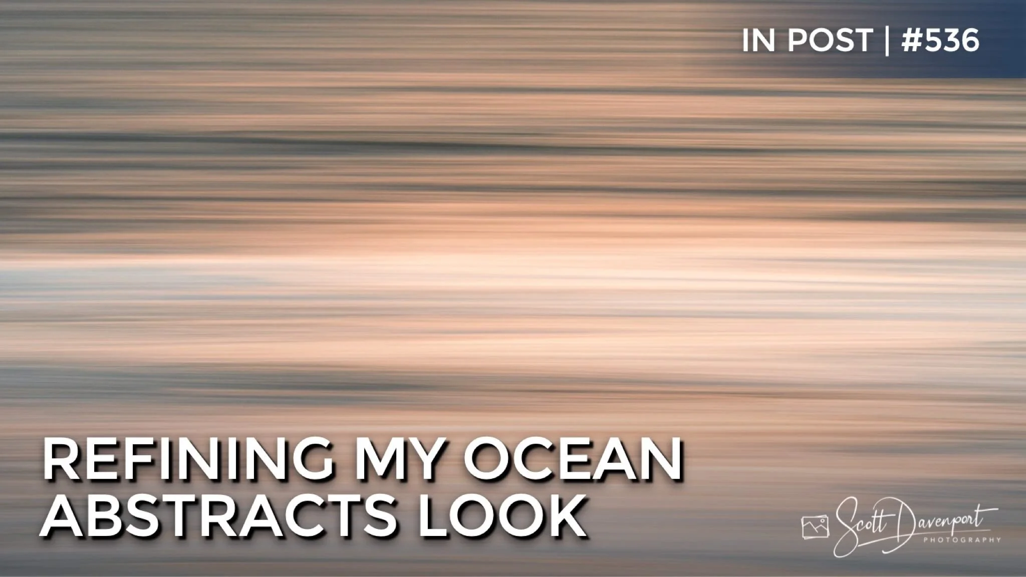
I have been exploring ocean abstracts of late. I’m still homing in on a set of go-to processing adjustments for them. Striking the right balance of soft dreaminess yet maintaining good separation of tones to emphasize the different streaks and ribbons in the water has been a tug of war. In this article, I share a few of the adjustments I’ve found are working well.
Auto Settings Are Too Aggressive
I have found the Auto buttons in Lightroom to be too aggressive for the look and feel I’m after with these abstracts. Notice how deep and dark the automatic settings make the image. The lower midtones are pulled all the way to the left of the histogram.
My basic processing is much less aggressive. Raising the exposure to brighten the scene and not concerning myself with a pure black or pure white point. For me, that doesn’t work for this scene.
The Auto buttons in Lightroom were too aggressive. Notice how automatic settings stretch the histogram out, trying to get a pure black and pure white point.
My basic adjustments are more reserved, erring on the side of a more open, airy feel. The histogram shows the majority of tones are in the mdirange.
An Airy, More Colorful Feel
A reasonably aggressive curve to raise the upper midtones has helped me get that brighter, airy feel I’ve been seeking with these scenes. The whitewash in the ocean brightens up, providing separation of the colored bands reflecting dappled sunlight.
Small changes in the HSL panel yield good color contrast. With the ocean at sunrise or sunset, a classic warm/cool color palette works very well. I’ve nudged the oranges slightly toward red, too. Gentle increases in saturation bring the look home.
A strong brightening curve on the upper midtones opens up the scene.
Playing up the classic warm/cool tones in the HSL panel. Also nudging the oranges a little toward red.
Balancing Detail
Final adjustments to clarity and texture help walk the line between soft and etherial, yet coaxing out detail among the ribbons of water. Luminance range masks targeting the darker tones of the image are helpful. Here, I used one with a boost of Clarity to deepen what few shadows are in the scene.
A final touch is a boost of Texture overall. Texture is already a subtle adjustments and with a scene that has few edges and no detail, the changes are subtler still. Nevertheless, there is an impact and the texture boost does add something to the scene.
A very subtle boost of clarity to the darkest tones in the scene. The ribbons of water are emphasized.
More emphasis to the ribbons of water with a global boost to Texture.
Ocean Ribbons 4
Contact Scott to commission a print or license this image.